CocosBuilder & iPhone 5 Resolution

CocosBuilder and cocos2d-iphone both now have support for the new iPhone 5 resolution, but when using CocosBuilder and fixed sized background images you still need to do a little custom coding as cocos2d does not have any image prefix handlers for the iPhone 5 resolution.

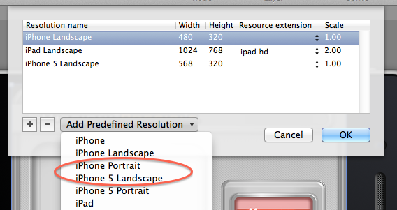
The first thing to do is add iPhone 5 resolution support to your CocosBuilder project. You do this by selecting the View->Edit Resolutions… menu option within CocosBuilder. Next select the iPhone 5 Landscape | Portrait option from the “Add Predefined Resolution” selector. We will assume we are working with an application that only supports Landscape mode from here on. Now you are set and you should be able to view your ccb file in the iPhone 5 resolution. Everything should look great if you used percentages to setup your positions and content sizes. Now you can publish your CocosBuilder project as normal.

If you run your cocos2d project at this time and have a CCSprite as your background image that should fill the entire screen, you will see that your background image is centered and has letter boxing on the left and right. This is because cocos2d does not automatically load an iPhone 5 version of your background-hd.png. At this time I do not know of any plans for cocos2d to be updated to support a new image file prefix for the iPhone 5, but it would be nice for situations like this. The current fix is simple enough so this is really a very minor issue and not worth complaining about.

To fix the issue you need to create a 1136×640 version of your background image and name it whatever you want, I used background-568h.png to somewhat follow Apple’s pattern. After you have added this new version of your background image to your Xcode project you should open CocosBuilder again and select your background image CCSprite.  Next you should add a “Doc root var” with the name of backgroundSprite. Make sure your document root element is pointing to the correct “Custom class”. Save and publish your CocosBuilder project. Now in your Xcode project add a new CCSprite instance var in your custom class .h file with the same variable name you specified in CocosBuilder. The final step is to go into the didLoadFromCCB method of your custom class and add the following code. This code will detect if the app is running in the iPhone 5 full 568×320 mode and if so replaces the background sprite with the new one and updates the texture rect. That is all there is to it and now you have easy support for the new iPhone 5 resolution in your existing CocosBuilder user interfaces.

CGSize winSize = [CCDirector sharedDirector].winSize;
if(winSize.width == 568)
{
    [backgroundSprite setTexture: [[CCSprite spriteWithFile:@"background-568h.png"]texture]];
    [backgroundSprite setTextureRect:CGRectMake(0, 0, winSize.width, winSize.height)];
}

Here is a screenshot of the final results of this solution. The existing menu and other elements position and sizes look great.

iOS App Icons: The Facebook Test

As an indie developer gaining visibility for a new application is a real challenge. The initial visibility in your application’s primary category and any initial PR can help drive some traffic towards your application, but both of those sources are short lived. So what chance does an indie developer have? The most important things that any indie developers should do when releasing an application is to focus on your app icon, the name of the app, the keywords, and the screenshots. No matter what you do to drive traffic to your app, once the user is in the AppStore they still need to decide if they want to purchase or download your app and the icon and screenshots are the quick decision factors. The description is useful if your icon and screenshots creates enough interest. Now with the new version of the AppStore in iOS 6 an apps first screenshot is going to become extremely important.

There are several ways you can evaluate the effectiveness of your keywords. You can use Google’s AdWords keyword tool or I would recommend using AppCodes service for selecting effective keywords. With icons I have had mixed results in the past where a group of users like a really simple icon design and the another set of users like a really elaborate icon. I was recently talking to a friend that suggested using Facebook to run several ads for different icon designs and see which one resulted in more click-throughs. I thought this suggestion was great so I created four ads, each with the same description and target audience. The only difference between the four ads was the image. Here are the icons, also in the order shown in the Facebook ad campaign results below.


I ran the ads for two full days on 9/13-9/14 . At first I thought the experiment was successful as the icon for the application I had originally selected to use in the AppStore was receiving more click throughs than the other icons, but then as we reached the end of the day on 9/13 a second icon quickly collected as many clicks as the first. Then on 9/14 both of those ads hovered and a third ad quickly collected as many clicks as the first icon.

So what is the result? I believe that my experiment showed that either it takes a lot of ad impressions in Facebook to draw in users that even take the time to look at the ads or simply that my icons were too similar to one another and were lackluster. I think my alternate icons had too similar of a core design, with just small design differences in the background and border of the icon. I have a new icon in design currently that is completely different that the original icons and has a 3D look. I will run that against the icon in the AppStore currently when it is finished to see if a much more visually appealing icon has any difference in a Facebook campaign.

Another interesting aside is that the additional clickthroughs generated through the Facebook ad campaign made absolutely no difference to my daily download/sales averages. I should have also created a separate campaign for each ad as Facebook will automatically prefer the more popular ads in a given campaign. More thoughts to come after I finish the test with the new icon, but please share your experiences with such Facebook ad campaigns in the comments!