As an indie developer gaining visibility for a new application is a real challenge. The initial visibility in your application’s primary category and any initial PR can help drive some traffic towards your application, but both of those sources are short lived. So what chance does an indie developer have? The most important things that any indie developers should do when releasing an application is to focus on your app icon, the name of the app, the keywords, and the screenshots. No matter what you do to drive traffic to your app, once the user is in the AppStore they still need to decide if they want to purchase or download your app and the icon and screenshots are the quick decision factors. The description is useful if your icon and screenshots creates enough interest. Now with the new version of the AppStore in iOS 6 an apps first screenshot is going to become extremely important.
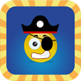
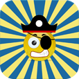
There are several ways you can evaluate the effectiveness of your keywords. You can use Google’s AdWords keyword tool or I would recommend using AppCodes service for selecting effective keywords. With icons I have had mixed results in the past where a group of users like a really simple icon design and the another set of users like a really elaborate icon. I was recently talking to a friend that suggested using Facebook to run several ads for different icon designs and see which one resulted in more click-throughs. I thought this suggestion was great so I created four ads, each with the same description and target audience. The only difference between the four ads was the image. Here are the icons, also in the order shown in the Facebook ad campaign results below.


I ran the ads for two full days on 9/13-9/14 . At first I thought the experiment was successful as the icon for the application I had originally selected to use in the AppStore was receiving more click throughs than the other icons, but then as we reached the end of the day on 9/13 a second icon quickly collected as many clicks as the first. Then on 9/14 both of those ads hovered and a third ad quickly collected as many clicks as the first icon.

So what is the result? I believe that my experiment showed that either it takes a lot of ad impressions in Facebook to draw in users that even take the time to look at the ads or simply that my icons were too similar to one another and were lackluster. I think my alternate icons had too similar of a core design, with just small design differences in the background and border of the icon. I have a new icon in design currently that is completely different that the original icons and has a 3D look. I will run that against the icon in the AppStore currently when it is finished to see if a much more visually appealing icon has any difference in a Facebook campaign.
Another interesting aside is that the additional clickthroughs generated through the Facebook ad campaign made absolutely no difference to my daily download/sales averages. I should have also created a separate campaign for each ad as Facebook will automatically prefer the more popular ads in a given campaign. More thoughts to come after I finish the test with the new icon, but please share your experiences with such Facebook ad campaigns in the comments!
![]()

